Plot an admixture graph
plot_graph(
graph,
fix = NULL,
title = "",
color = TRUE,
textsize = 2.5,
highlight_unidentifiable = FALSE,
pos = NULL,
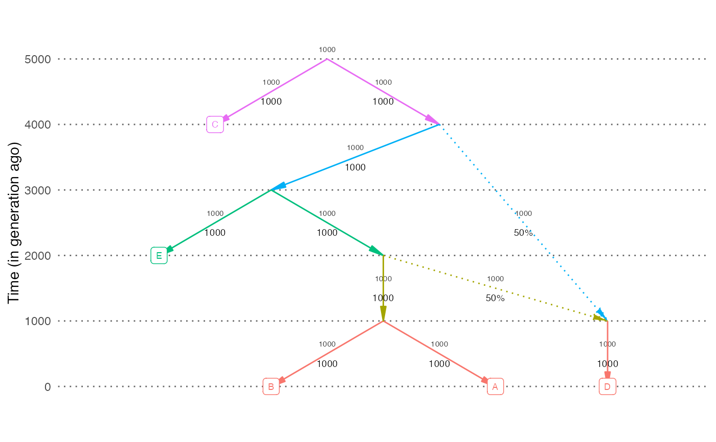
dates = NULL,
neff = NULL,
scale_y = FALSE,
hide_weights = FALSE
)Arguments
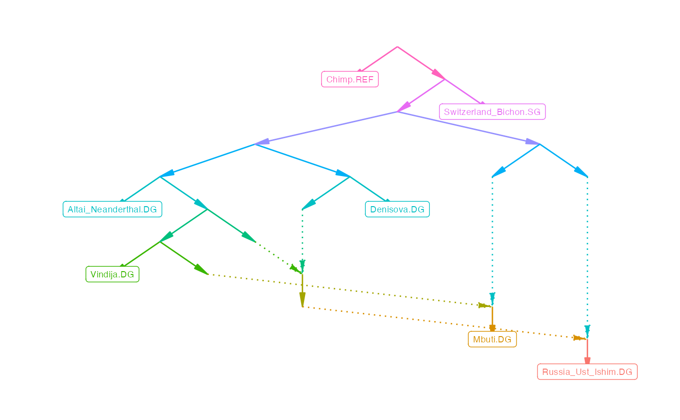
- graph
An admixture graph. If it's an edge list with a
labelcolumn, those values will be displayed on the edges- fix
If
TRUE, there will be an attempt to rearrange the nodes to minimize the number of intersecting edges. This can take very long for large graphs. By default this is only done for graphs with fewer than 10 leaves.- title
A plot title
- color
Plot it in color or greyscale
- textsize
Size of edge and node labels
- highlight_unidentifiable
Highlight unidentifiable edges in red. Can be slow for large graphs. See
unidentifiable_edges.- pos
An optional data frame with node coordinates (columns
node,x,y)- dates
An optional named vector with dates (in generations) for each node to plot dates on the y-axis (e.g.,
c('R'=1000, 'A'=0, 'B'=0)). If this option is supplied, the y-axis will display dates in generations.- neff
An optional named vector with effective population sizes for each population (e.g.,
c('R'=100, 'A'=100, 'B'=100)). If this option is supplied, the effective population size of each population will be shown next to the corresponding edge.- scale_y
If
TRUE, scale the y-axis according todatesvector. The default isFALSE.- hide_weights
A boolean value specifying if the drift values on the edges will be hidden. The default is
FALSE.
Value
A ggplot object
Examples
plot_graph(example_graph)


# Plot a random simulation output. Show dates and population sizes on the plot
out = random_sim(nleaf=5, nadmix=1)
plot_graph(out$edges, dates=out$dates, neff=out$neff)
# Plot a random simulation output. Show dates and population sizes on the plot
out = random_sim(nleaf=5, nadmix=1)
plot_graph(out$edges, dates=out$dates, neff=out$neff)